Charting data with gnuplot
 Jim Hall
Image by: Opensource.com CC-by-SA 4.0
I’m working on a hobby book project that will include a lot of charts. And I really mean it—there are a ton of charts.
I want to make sure that my charts and graphs all look the same. With that many graphs, doing it in a spreadsheet application like LibreOffice isn’t very appealing. That’s okay for a few charts, but after a dozen or more charts, I know making each chart look the same will become tedious, especially if I decide halfway through the project that it would be better if all of the charts used a slightly different style. Updating every chart by hand will be impossible.
So I’m going back to a plotting system that I used in the 1990s when I was an undergraduate physics student: gnuplot.
What is gnuplot
Despite the name, gnuplot is not part of the GNU project and has nothing to do with the Free Software Foundation. It was developed independently; the name is a compromise among the developers.
gnuplot (the name is properly spelled all lowercase) specializes in visualizing data. I used it in my undergrad years to make plots of my physics lab data or to show the results of equations, but gnuplot supports other chart types including:
- Two-dimensional functions and data plots combining many different elements such as points, lines, error bars, filled shapes, labels, arrows, …
- Polar axes, log-scaled axes, general nonlinear axis mapping, parametric coordinates
- Data representations such as heat maps, beeswarm plots, violin plots, histograms, …
- Three-dimensional plots of data points, lines, and surfaces in many different styles (contour plot, mesh)
- Algebraic computation using integer, floating point, or complex arithmetic
- Data-driven model fitting using Marquardt-Levenberg minimization
- Support for a large number of operating systems, graphics file formats and output devices
- Extensive on-line help
- TeX-like text formatting for labels, titles, axes, data points
- Interactive command line editing and history
You can also generate all kinds of output, including PDF (which you can include in a LaTeX document) or a PNG image (which is useful in lots of places). These output types are defined as terminals; by default, gnuplot uses a graphical “terminal” output so you can see the results as you go.
A few samples
First, run gnuplot from the command line, which will start the program in interactive mode with a gnuplot> prompt:
$ gnuplot

    G N U P L O T
    Version 6.0.3 patchlevel 3    last modified 2025-06-01

    Copyright (C) 1986-1993, 1998, 2004, 2007-2025
    Thomas Williams, Colin Kelley and many others

    gnuplot home:     http://www.gnuplot.info
    faq, bugs, etc:   type "help FAQ"
    immediate help:   type "help"  (plot window: hit 'h')

    Terminal type is now qt
gnuplot>
Let’s start by plotting the sine curve. To do that, enter this instruction:
> plot sin(x)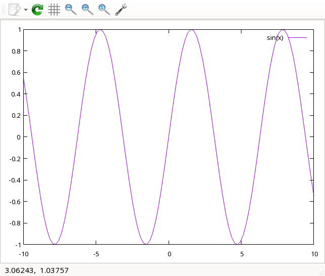
If you move your mouse over the chart, gnuplot will show the x,y coordinates in the lower-left of the screen. The “3.06243, 1.03757” numbers show the coordinates where I happened to move my mouse when I took the screenshot; you can ignore these numbers in my screenshots.
Without parameters, gnuplot assumes some defaults for the chart. It tries to adjust the y axis to show all of the values, which is why the y axis goes from -1 to 1. I didn’t provide an x axis range, so gnuplot charted the values from -10 to 10.
Adjust the range for the axes using square brackets. The first set of brackets defines the x range, providing a second set of brackets also specifies the y range. Let’s display the sine curve from 0 to pi, like this:
> plot [0:pi] sin(x)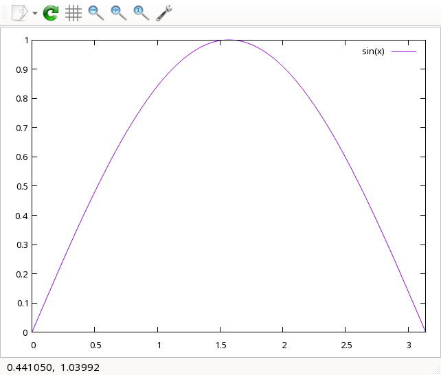
That only shows half of the sine curve, so let’s adjust this to 2 pi instead:
> plot [0:2*pi] sin(x)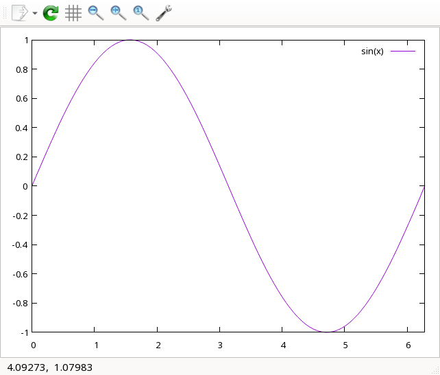
A common chart that I will need to produce is a line graph, using x,y data. Let’s look at an example. I created some simple linear data, and saved it to a file. Each x and y value is separated by a space, each x,y pair is on a new line.
1.21 2.1
1.22 2.2
1.23 2.3
1.24 2.4
1.25 2.5
1.26 2.6
1.27 2.7
1.28 2.8
1.29 2.9
Save this file as line.dat, and use gnuplot to chart it.
> plot 'line.dat'This generates a simple x,y chart that shows each data pair as a point on the chart. It looks very line-shaped, because that’s how I created the data:
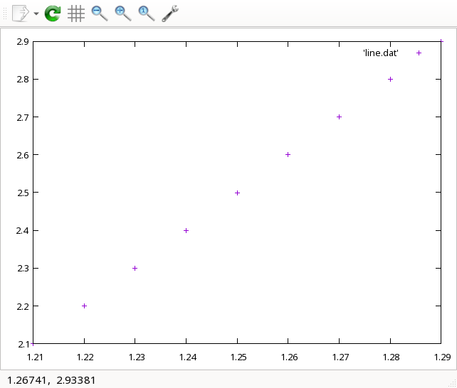
My typical use case will require showing both data points and lines. To do that, change the chart style using the with linespoints phrase:
> plot 'line.dat' with linespoints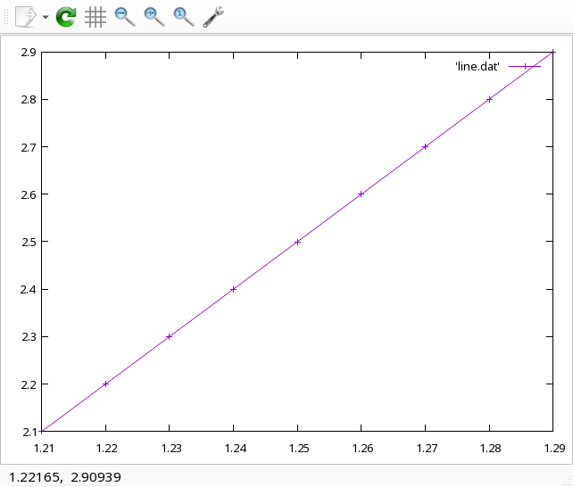
But in this case, I don’t like how the data is displayed, with the x axis from 1.21 to 1.29, and the y axis from 2.1 to 2.9 (the data starts at 1.21,2.1 and ends at 1.29,2.9). Let’s change the x axis from 1.2 to 1.3, and the y from 2 to 3 using a pair of square brackets:
> plot [1.2:1.3] [2:3] 'line.dat' with linespoints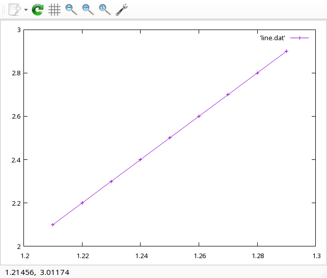
For my project, I’ll need to save the output in a format that can be used in a LaTeX document. One way to do this is to save the chart as a PDF file, and include it in a LaTeX document with \usepackage{graphicx} and \includegraphics{chart}. If you process the LaTeX document using the latex command, \includegraphics{chart} will look for chart.ps. If you use the pdflatex command to generate PDF output, \includegraphics{chart} will look for chart.pdf.
Let’s save this chart so it can be included in a LaTeX document. To do that, you need to change the “terminal” type to pdf. Then, set the output to a new file and regenerate the chart:
gnuplot> set terminal pdf

Terminal type is now 'pdfcairo'
Options are ' transparent enhanced fontscale 0.5 size 5.00in, 3.00in '
gnuplot> set output "line.pdf"
gnuplot> plot [1.2:1.3] [2:3] 'line.dat' with linespoints
I can’t include a PDF chart in this article, so let me change the “terminal” type to png and regenerate the chart with a new name:
gnuplot> set terminal png

Terminal type is now 'png'
Options are 'truecolor nocrop enhanced butt size 640,480 font "/usr/share/fonts/dejavu/DejaVuSans.ttf,12.0" '
gnuplot> set output "gnuplot-line-chart.png"
gnuplot> plot [1.2:1.3] [2:3] 'line.dat' with linespoints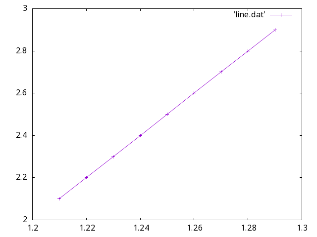
You don’t have to generate all of the charts in “interactive” mode. gnuplot also supports reading commands from a file; this makes it much easier to keep all charts looking the same. For example, to regenerate the same chart the same way every time, I could save these commands in a file called line.gnuplot (the extension doesn’t matter)
set terminal png
set output "gnuplot-line-chart.png"
plot [1.2:1.3] [2:3] 'line.dat' with linespoints
To generate the chart again, run gnuplot with this file as an option:
$ gnuplot line.gnuplotI’m looking forward to using this feature to generate all of my charts using similar options, so they all look the same.
gnuplot supports a ton of options and can display all kinds of charts and graphs, including box plots, surface plots, histograms, Gantt charts, vector, splines, scatter plots, and other kinds of charts. You can see demos of different chart styles on the gnuplot website. To learn how to use gnuplot, start with the online tutorials and other resources, also available on the gnuplot website.

 Seth Kenlon