Data analysis with gnuplot
 Jim Hall
When I was an undergraduate physics student in the early 1990s, we performed all kinds of data analysis. For some labs, we analyzed data by writing a custom program in FORTRAN. But for other labs, we could refactor the equations so that we could perform a linear regression on the data, which was easy to do in a spreadsheet.
I’m rediscovering another tool that I used at the time: gnuplot. This is a powerhouse for creating charts and graphs. But it can also perform line-fitting and other regression analysis. Let’s take a look.
Linear data
For this test, I created some sample data that is almost a line, but has some slight variations in the data (like you might have with experimental deviation). I generated 9 x,y pairs, from x = 1 to 9, and y from about 101 to about 109. To add some random variance in the y values, I used the $RANDOM variable from Bash:
$ (for x in $(seq 9); do echo $x 10$x.$RANDOM; done) > xy.dat

$ cat xy.dat
1 101.25622
2 102.25919
3 103.27729
4 104.2294
5 105.8165
6 106.7244
7 107.32100
8 108.27283
9 109.9938
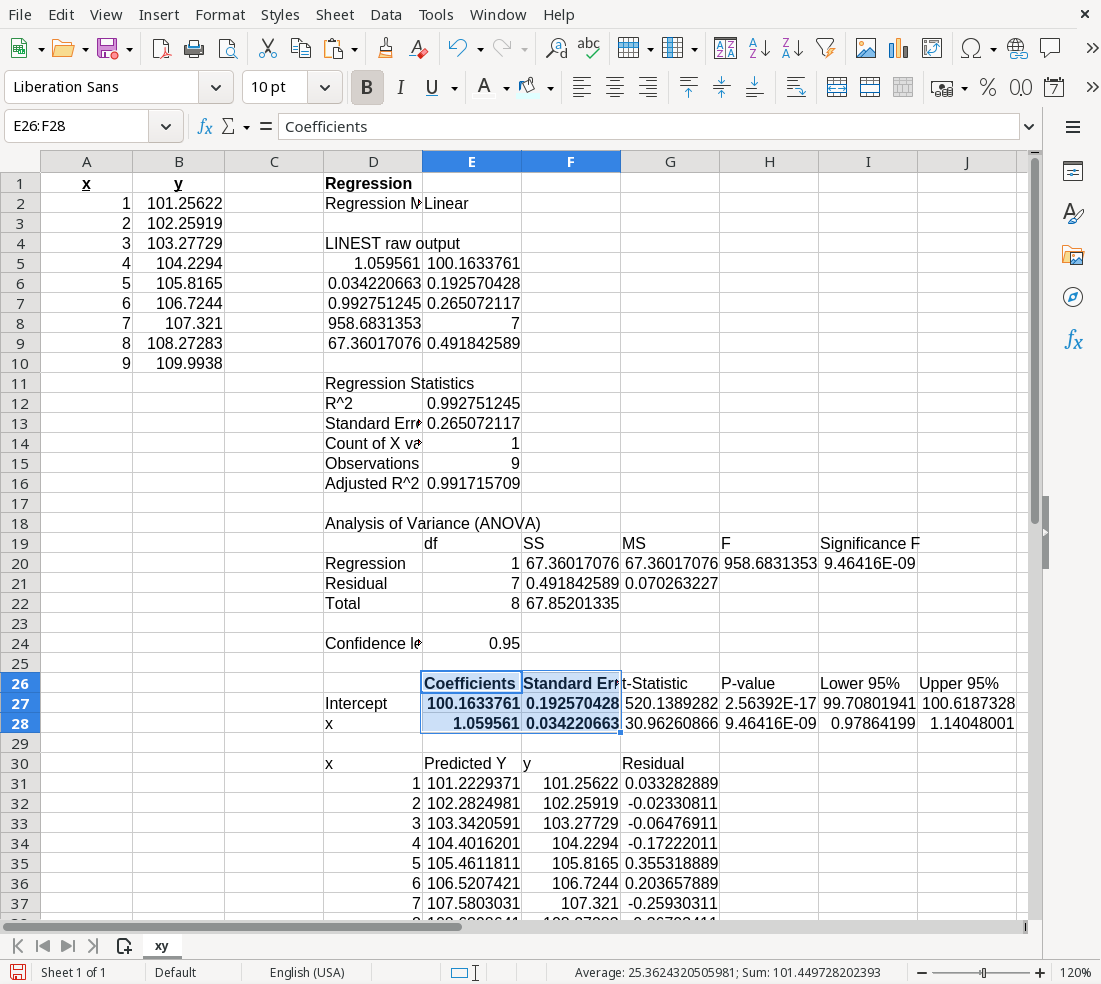
I wanted to have a reference to see what the correct linear regression values should be. I loaded the data into LibreOffice Calc and used Data > Statistics > Regression to perform a linear fit of the data. LibreOffice calculated the parameters as
y = (100.163 ± 0.192) + (1.0595 ± 0.034)x
That is, the intercept is 100.16 plus or minus 0.19, and the slope is 1.059 plus or minus 0.034. The “plus or minus” is also called the standard deviation, and is a typical way to show “uncertainty” in the values.
Linear analysis using gnuplot
Let’s do the same analysis with the gnuplot program. gnuplot is an interactive program, and you type commands from the Linux terminal.
$ gnuplot

    G N U P L O T
    Version 6.0.3 patchlevel 3    last modified 2025-06-01

    Copyright (C) 1986-1993, 1998, 2004, 2007-2025
    Thomas Williams, Colin Kelley and many others

    gnuplot home:     http://www.gnuplot.info
    faq, bugs, etc:   type "help FAQ"
    immediate help:   type "help"  (plot window: hit 'h')

    Terminal type is now qt
The gnuplot program can perform regression analysis. The algorithm is a standard method: it minimizes the sum of the squares between the data points and the function that you “fit” to the data.
To start, you need to define a function that describes the data. In this case, the data is linear, so I can enter a formula for a line. I’ve specified i for the intercept and s for the slope:
gnuplot> f(x) = i + s * xThen, you can instruct gnuplot to perform a “fit” of the function to the data, using the fit command. Provide the name of the function (in this case, that’s the f(x) function) and the name of the file that contains the x,y data. Also indicate the variables in the equation using the via keyword. gnuplot will perform an analysis and print the results:
gnuplot> fit f(x) 'xy.dat' via i, s
iter      chisq       delta/lim  lambda   i             s
   0 8.9033443626e+04   0.00e+00  4.04e+00    1.000000e+00   1.000000e+00
   1 1.4504263892e+04  -5.14e+05  4.04e-01    1.315399e+01   1.404999e+01
   2 9.4785384252e+01  -1.52e+07  4.04e-02    9.310936e+01   2.180155e+00
   3 4.9191609003e-01  -1.92e+07  4.04e-03    1.001571e+02   1.060551e+00
   4 4.9184258903e-01  -1.49e+01  4.04e-04    1.001634e+02   1.059561e+00
   5 4.9184258903e-01  -4.97e-10  4.04e-05    1.001634e+02   1.059561e+00
iter      chisq       delta/lim  lambda   i             s

After 5 iterations the fit converged.
final sum of squares of residuals : 0.491843
rel. change during last iteration : -4.966e-15

degrees of freedom    (FIT_NDF)                        : 7
rms of residuals      (FIT_STDFIT) = sqrt(WSSR/ndf)    : 0.265072
variance of residuals (reduced chisquare) = WSSR/ndf   : 0.0702632

Final set of parameters            Asymptotic Standard Error
=======================            ==========================
i               = 100.163          +/- 0.1926       (0.1923%)
s               = 1.05956          +/- 0.03422      (3.23%)

correlation matrix of the fit parameters:
                i      s
i               1.000
s              -0.889  1.000
That’s a lot of output! The output shows the iterations as gnuplot used different values. The chisq column indicates the χ2 value, which is the sum of the squares of the differences between the data and the “fit” line. This converged after 5 iterations.
Below that, gnuplot shows the final parameters: the intercept is 100.163 plus or minus 0.1926, and the slope is 1.05956 plus or minus 0.03422. (Compare that to the values calculated by LibreOffice: the intercept was 100.16 plus or minus 0.19, and the slope was 1.059 plus or minus 0.034. These are the same values!)
Charting the results
We can now chart the data using gnuplot. In the simplest case, we can use the plot command to create a chart of the f(x) function; gnuplot will fill in the values that it calculated the i and s.
gnuplot> plot f(x)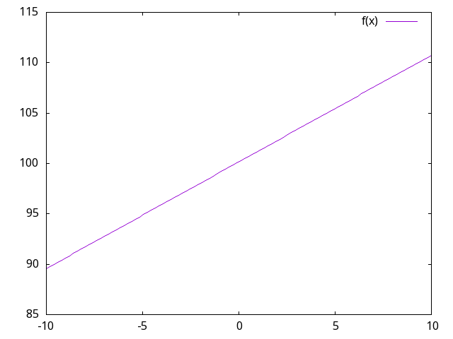
But gnuplot can chart more than one thing at a time. Let’s add the x,y data points to the chart. To do that, type a comma then add the other chart command:
gnuplot> plot f(x), 'xy.dat' 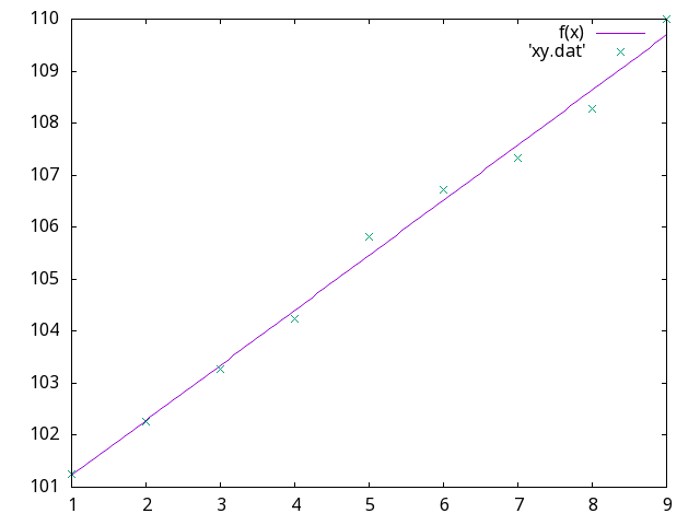
I prefer that my x axis starts at zero, to make it easier for people to read the chart values and identify the intercept. To specify a range for the x axis, provide the start and end values in square brackets:
gnuplot> plot [0:10] f(x), 'xy.dat' 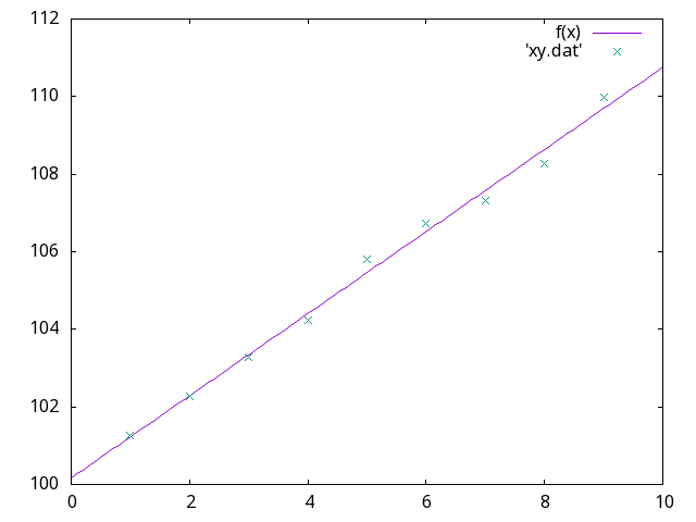
I love that gnuplot is so flexible. It does more than simple charting; it’s also a scientific analysis tool. Explore the gnuplot website to learn what else you can do with gnuplot. For more about fitting functions to data, see the line fit demos.



 Seth Kenlon