Usability testing in open source software

I’ve been involved in open source software since 1993, but starting around ten years ago I developed an interest in usability testing in open source software. During a usability testing class as part of my Master’s program in Scientific and Technical Communication, I studied the usability of GNOME and Firefox. Later, I did a deeper examination of the usability of open source software, focusing on GNOME, as part of my Master’s capstone project.
Since then, I’ve worked with the GNOME Design Team where I helped with usability testing. While working with GNOME, I mentored several interns in Outreachy. I wanted to share some of the excellent work in usability testing in open source software.
What is usability?
What do we mean when we talk about “usability”? You can find some formal definitions of usability that talk about the Learnability, Efficiency, Memorability, Errors, and Satisfaction. But I find it helps to have a “walking around” definition of usability.
A great way to summarize usability is to remember that real people are busy people, and they just need to get their stuff done. So a program will have good usability if real people can do real tasks in a realistic amount of time.
User eXperience (UX) is related, but not the same as usability. Where usability is about real people doing real tasks in a reasonable amount of time, UX is more about the emotional connection or emotional response the user has when using the software.
You can test usability in different ways. I find the formal usability test and prototype test work well. You can also indirectly examine usability, such as using an expert to do a heuristic evaluation, or using questionnaires. But really, nothing can replace watching a real person trying to use your software; you will learn a lot just by observing others.
How to do a usability test
People think it’s hard to do usability testing, but it’s actually easy to do a usability test on your own. You don’t need a fancy usability lab or any professional experience. You can do a usability test with just a laptop; you can even do a remote usability test using a video meeting platform like Jitsi, Google Meet, or Zoom.
If you’re starting from scratch, you really have three steps to do a formal usability test:
- Consider who your users are. Write this down as a short paragraph for each kind of user for your software. Make it a realistic fiction. These are your Personas. With personas, you can make design decisions that always benefit the user. “If we change _ then that will make it easier for users like Jane.” “If we add _ then that will help people like Steve.”
- For each persona, write a brief statement about why that user might use the software to do their tasks. There are different ways that a user might use the software, but just jot down one way. This is a Use Scenario. With scenarios, you can better understand the circumstances when people use the software.
- Now take a step back and think about the personas and scenarios. Write down some realistic tasks that real people would do with the software. Make each one stand on its own. These are scenario tasks, and they make up your actual usability test. Where you should write personas and scenarios in third-person (“__ does this..”) you should write scenario tasks in second-person (“you do this..”) Each scenario task should set up a brief context, then ask the tester to do something specific. For example:
You don’t have your glasses with you, so it’s hard to see the text on the screen. Make the text bigger so you can read it more easily.
The challenge in scenario tasks is not to accidentally give hints for what the tester should do. Avoid using the same words and phrases from menus. Don’t be too exact about what the tester should do – instead, describe the goal, and let the tester find their own path. Remember that there may be more than one way to do something.
Iterative usability testing
The key in doing a usability test is to make it iterative. Do a usability test, analyze your results, then make changes to the design based on what you learned in the test. Then do another test. But how many testers do you need?
You don’t need many testers to do a usability test if you do it iteratively. Doing a usability test with five testers is enough to learn about the usability problems and make tweaks to the interface. At five testers, you’ve uncovered more than 80% of usability problems, assuming most testers can uncover about 31% of issues (typical).
But you may need more testers for other kinds of usability tests. “Only five” works well for traditional/formal usability tests. For a prototype test, you might need more testers. But five is enough for most tests.
If every tester can uncover about 31% of usability problems, then note what happens when you have one, five, and ten testers in a usability test. You can cover 31% with one tester. With more testers, you have overlap in some areas, but you cover more ground with each tester. At five testers, that’s pretty good coverage. At ten testers, you don’t have considerably better coverage, just more overlap.
Asking the right questions
During a usability test, it’s important to understand what the tester is thinking. What were they looking for when they couldn’t find a button or menu item? During the usability test, I recommend that you try to observe, take notes, and capture as much data as you can about what the tester is doing. Only after the tester is finished with a scenario or set of scenarios should you ask questions.
But how do you ask questions in a way to gain the most insight? Asking the right questions can sometimes be an art form; it certainly requires practice. A colleague shared with me a few questions she uses in her usability interviews, and I am sharing them here for your usability interviews:
Before starting a scenario or set of scenarios:
- What are three things you might do in this application?
- What menu options do you see here and what do you think they do?
- What might you do on this panel?
- What is your first impression of the application?
- What do these icons do? What do they represent?
After finishing a set of scenarios:
- Who do you think the application was created for?
- How easy did you think it was to get around the application?
- If you could make one change to the application, what would it be?
- Is there a feature you think is missing?
- Do you remember any phrases or icons that you didn’t understand?
The goal is to avoid leading questions, or any questions that suggest a “right” and “wrong” answer.
Charting usability test results
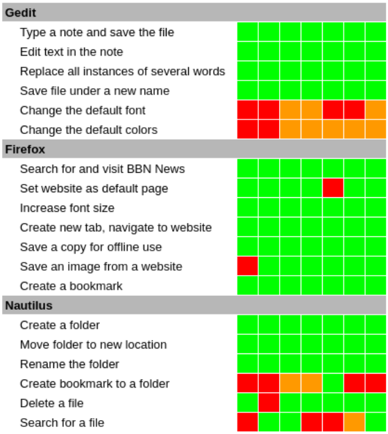
Let me show you a usability test that I did several years ago. I like to show results in a “heat map,” which I find to be a convenient way to show test results. In a heat map, you display scenario tasks in rows and testers in columns, and you use a color in each cell where “scenario task” and “tester” meet to show how difficult that task was for that user.
For the color, I use this scale:
- Green if the tester easily completed the task. For example, if the tester seemed to know exactly what to do, what menu item to activate or which icon to click, you would code the task in green for that tester.
- Yellow if the tester experienced some (but not too much) difficulty in the task.
- Orange if the tester had some trouble with the task. For example, if the tester had to poke around the menus for a while to find the right option, or had to hunt through toolbars and selection lists to locate the appropriate icon, you would code the task in orange for that tester.
- Red if the tester experienced severe difficulty in completing the task.
- Black if the tester was unable to figure out how to complete the task, and gave up.
There are some “hot” rows here, which show tasks that were difficult for testers: setting the font and colors in gedit, and setting a bookmark in Nautilus. Also searching for a file in Nautilus was a bit challenging, too. So my test recommended that the GNOME Design Team focus on these four to make them easier to do.
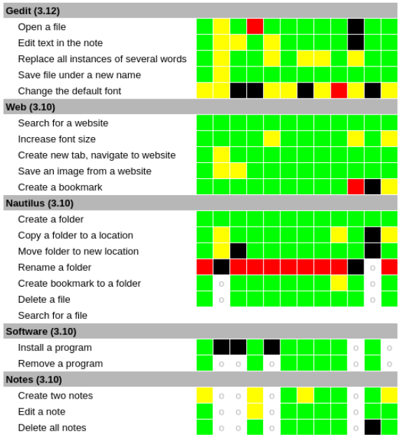
Let’s look at a heat map from a different usability test. Note that I tried to do a lot here, so you’ll see some empty cells. The gray “o” in each cell is where we didn’t have enough time to do that task. (Let this be a lesson: You need to be realistic in your time. Try for less than an hour, but reserve an hour for each test to make sure your testers have enough time.)
You can see some “hot rows” in this test, too. For example: Setting the font in gedit, and renaming a folder in Nautilus. And changing all instances of some words in gedit, and installing a program in Software, and maybe creating two notes in Notes. These are all hot rows:
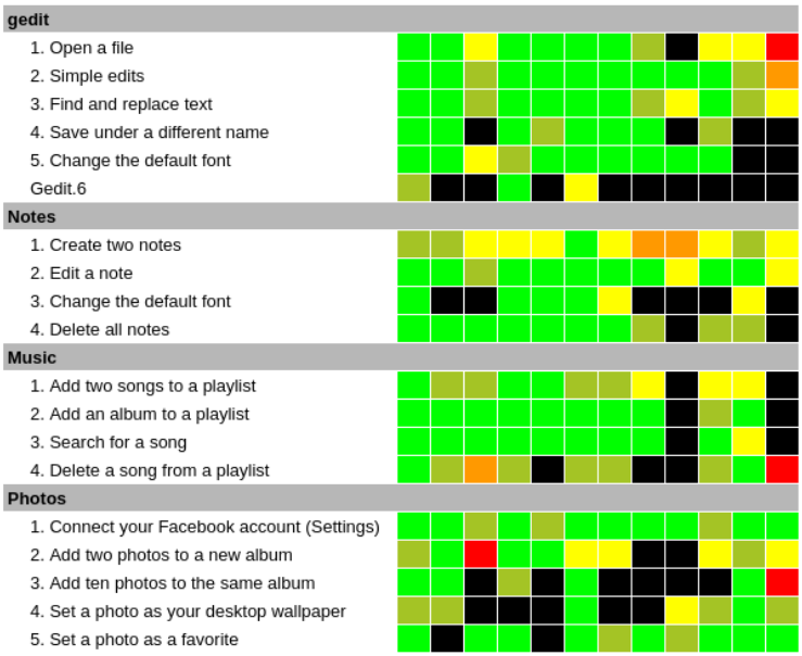
Working with Outreachy, I mentored Sanskriti in a usability test that was similar to mine, so we could measure how GNOME’s usability had improved. She had a slightly different color map here, using two tones for green. But you can see a few hot rows: changing the default colors in gedit, adding photos to an album in Photos, and setting a photo as a desktop wallpaper from Photos. Also some warm rows in creating notes in Notes, and creating a new album in Photos.
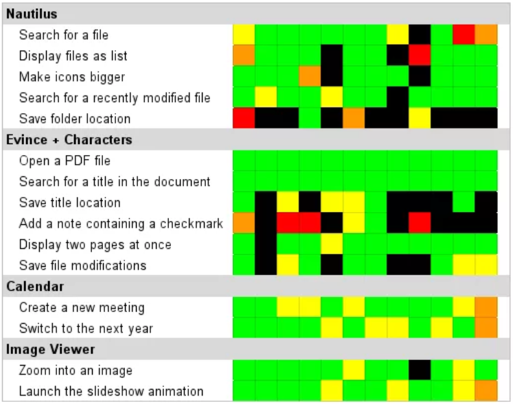
In another cycle of Outreachy, I mentored Gina in another traditional usability test. And you can see some hot rows in Gina’s test, most clearly in bookmarking a location in Nautilus, adding a special character (checkmark) using Characters and Evince, and saving the location (bookmark) in Evince. Also some warm rows, such as changing years in Calendar, and saving changes in Evince. Maybe searching for a file in Nautilus.
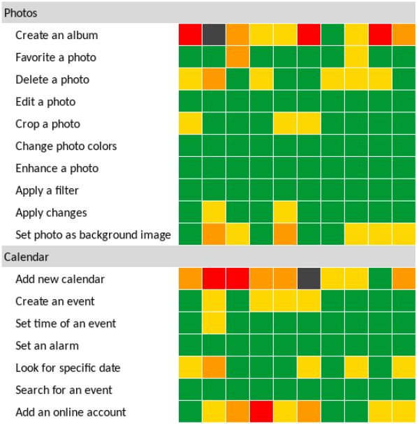
And in another cycle of Outreachy, I mentored Renata in another traditional usability test. In Renata’s heat map, you can see some hot rows, such as when creating an album in Photos, adding a new calendar in Calendar, and connecting to an online account in Calendar. And maybe deleting a photo in Photos and setting a photo as a wallpaper image in Photos. Some issues in searching for a date in Calendar, and creating an event in Calendar.
Improving usability helps open source
I hope this helps you to do usability testing on your own programs. Usability is not hard, the key is to be intentional with planning your test and analyzing the results. That’s where the heap map really comes into play. With the heat map, you can see which tasks were most difficult for your testers, and you can use your notes to understand what caused users to be confused. Then you can focus on improving those areas of your programs so they are easier to use.
Ideally, projects will go through several iterations of usability testing followed by design improvements. In my experience, most projects that follow an iterative process like this can usually arrive at a design that works well for almost everyone within about three iterations of testing and updates.
And through usability testing, we can make open source software projects easier for everyone to use. And that helps everyone. By improving usability, we help open source.