Why beauty matters in computing

I can just imagine the comments and questions as you read the headline. “Who cares,” and, “Why is that important?,” spring to mind along with a derisive, dismissive, and sarcastic tone of voice.
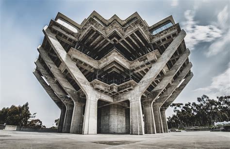
It’s easy to think of computers and computing as nothing more than complex, powerful tools in which form follows function. This is the kind of design thinking that, when taken to an extreme, leads to post-WWII brutalist architecture that produced some of the ugliest buildings on the planet.
Like the building in Figure 1, brutalism exposes the supporting frameworks and materials of it’s structures and eschews cosmetic overlays that would hide their most basic structural and functional components. The raw materials used to construct these buildings such as concrete, wood, steel, and others are left apologetically undisguised and open to direct view of the observer, including all it’s flaws such as those in the forms used when pouring the concrete.
There is also beauty in the brutalism.
Beauty is such an abstract and subjective concept that it’s difficult to define. I certainly can’t put it into words though I know it when I see it. Ironically, brutalism is the basis for the beauty of open source software such as Linux.
Hardware
Let’s take a look at hardware before we launch into the subject of software and beauty.

During the 1920’s and 1930’s, the Art Deco movement aspired to beautify everything from the most mundane to the most frivolous aspects of our environment.
This included transportation like the New York Central J2 steam engine in Figure 2. The steam engines of the railroads were always unintentionally brutalisic in their construction, with pipes, valves, driving rods, and wheels all out in the open and available for any passers-by to see.
In the 1930’s, industrial designer Henry Dreyfus designed the streamlined shroud for the Hudson-type locomotives of the New York Central railroad. While streamlining can improve performance and speed, this was primarily intended as a way to display both the beauty and power of these engines and, by extension, that of the railroad itself.
This design hides many of the external working aspects of the engines such as pipes and valves, while leaving the steam cylinders, pistons, and driving rods open to view. This displayed not only the impression of speed in the streamlining, but also the impression of power through the exposure of the most obvious moving parts on any steam locomotive.
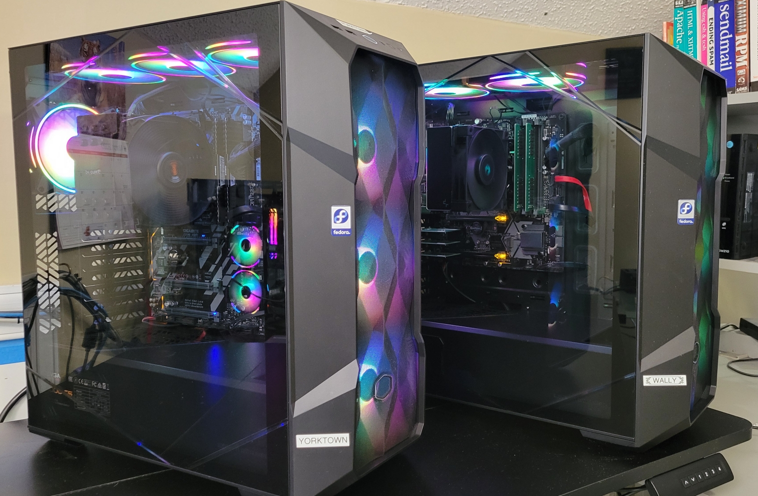
How does this apply to computers? Let’s take a look at two of mine. The computer closest to the viewer in Figure 3 is the web and email server for Both.org, among other things. The second computer is my firewall and router. Both of these computers are hard-working computers and they run 24×7 except when I take them down for maintenance.

To me, the beauty starts with the motherboard in each. The motherboards are designed and manufactured by two different companies, yet they’re very much alike because they still conform to the physical layout design of the original IBM PC from 1981. The CPUs are still located in the right center, the RAM below that (and sometimes a second set of DIMMs above the CPU), the external connector on the upper right, and the system bus connectors on the upper left.
This same basic layout continues to be used because it is well-designed, the most efficient use of space, and places the memory close to the CPU to minimize the distance and maximize the speed of data flowing between them. If you have an opportunity to look at a modern motherboard, you’ll find that same layout with the addition of additional power connectors, audio, USB2 and 3 connectors, SATA hard drive connectors, and more. You’ll also see the beauty of the design in the layout. If you zoom in enough, you’ll also see the beauty in the patterns of the conductor paths on the surface of the motherboard.

Figure 5 shows the MSI Z370 H3 motherboard like the one I use in one of my computers. So while it has evolved significantly, the basic motherboard design for major component locations remains the same. Here again, you can zoom in on the image to see the intricate and beautiful patterns of the conductors.
Software
Software can be beautiful, too. Much of the beauty I find in Linux is due to the ironically brutalistic nature of open source software. It’s open and exposed to those who choose to look further than the windows on the computer display, and explore the code itself, which is one of the hallmarks of open source. Open source software also works well and is usually easier and more intuitive to use than most of the proprietary software I’ve been forced to use in a couple of my jobs.
Poorly written software can result in poorly performing and defective programs. In most cases, the poorly written software is closed source, proprietary, and costs money. If you could view the code of most poorly written software, it would probably look like a plate of cooked spaghetti, in which you can’t see a beginning, and end, or what might be intended as a strand that performs any specific task. It would not be pretty to look at, even if you are not a programmer. Code like this looks ugly and it’s often ugly to use.
The alternative, well-written code is not only easy and a pleasure to use, but it also looks good when you view the source code. You’ll see patterns and be able to trace the flow of execution through the code. Individual functions will be grouped into well-documented structures that are easy to parse and understand if you are a programmer, and that are organized in such a way as to be beautiful even to non-programmers. Well-written, beautiful software is also much easier to maintain.
I was hired for one of my jobs to fix problems in a system of programs that powered a web site. The code was ugly. It was difficult to understand how it worked — or why it didn’t — and nearly impossible to maintain. The first thing I did with each program in that system was to reframe the code so that each line in the file contained one and only one program statement. I then added indents where appropriate to add visual cues to the organization of the code. While doing that I added comments as I discerned the purpose of each code section.
While doing that cleanup, I encountered a number of quite obvious bugs and fixed them immediately. I went on to analyze the code more deeply and discovered that the poorly named variables I’d noticed right away were a mess. Since variable names like $X4 give no indication of the type of value they might contain, I renamed them as I found their purpose to ones like $UserID, which is a bit longer but imparts valuable information. After renaming all the variables, I discovered some that were initialized to a value but never used. Some variables were duplicates in function of others and could be renamed to eliminate confusion caused by having two variable names for the same thing. During this pass through the code, I discovered and fixed more bugs.
By the time I finished that project, the code looked good, was easier to maintain, and had far fewer bugs.
Elegance
This conjunction of beauty in both hardware and software creates an elegant fusion of form and function that looks good, like a work of art, and works as well with the user as it does for the computer.