Using LibreOffice to chart x,y data
 Jim Hall
When I was an undergraduate physics student in the early 1990s, we wrote a lot of FORTRAN 77 programs to analyze lab data or perform simulations. FORTRAN is an old programming language, but it makes easy work for anything that involves mathematics.
Unfortunately, FORTRAN 77 doesn’t support any kind of graphics interface. You can’t just draw a chart in graphics mode to see what your data looks like. Instead, you have to generate your data and use another program to display a chart from it.
Here’s one example to do that, using LibreOffice to chart x,y data generated from a FORTRAN 77 program.
The Mandelbrot Set
One way to demonstrate x,y data is with complex numbers. Complex numbers are always a 2-value number: a real part and an imaginary part, usually written as x + yi where x is the real part and y is the imaginary part. The value for i is actually “the square root of -1” which isn’t usually allowed—unless you use complex numbers, then “the square root of -1” is just the complex number 0 + 1i. With both a real part and an imaginary part, you can think of a complex number as basically x,y data.
The Mandelbrot Set is a plot of the complex numbers in a certain range, using the function z = z2 + c where both z and c are complex numbers. To calculate the Mandelbrot set, you iterate through different values of c, and always use a starting value of z = 0. Each iteration uses the previous value of z, so you calculate one value of z as z = z2 + c, then use that value of z for the next iteration, as z = z2 + c.
Calculating the values in FORTRAN 77
This is easy to calculate in FORTRAN 77, since FORTRAN has a COMPLEX data type. If we have two REAL variables X and I, we can combine these to create a COMPLEX value in FORTRAN, using the function CMPLX(X,I).
I won’t go into the details of the FORTRAN 77 programming language here, except to note that every line is usually written in all-uppercase. Each line uses column rules: Columns 1 to 5 are for line labels, which look like line numbers but are really just references. A line with C or * in column 1 is ignored as a comment line. Column 6 indicates a continuation from the previous line. Columns 7 to 72 are for program statements.
FORTRAN supports several kinds of conditional statements. One is the IF statement, which you might recognize from other programming or scripting languages. Another is the DO statement, which is essentially a kind of loop that specifies the starting value, ending value, and increment value.
With these basics, we can write a short FORTRAN 77 program that iterates between different values of C, from the starting complex number −2.5 + 1i in the upper left to the ending value 1 − 1i in the lower right. At the start of each iteration, we set the initial value of Z to zero.
      PROGRAM MDELBROT
      PARAMETER(STEP=.05)
      REAL DIST
      REAL X,I
      COMPLEX Z,C
      INTEGER COUNT
      DO 100 X=-2.5,1.0,STEP
      DO 90  I=1.0,-1.0,-STEP
      C = CMPLX(X,I)
      Z = CMPLX(0.0, 0.0)
      COUNT = 0
10    Z = Z**2 + C
      DIST=REAL(Z)**2 + IMAG(Z)**2
      COUNT = COUNT + 1
      IF ((DIST.LT.4.0) .AND. (COUNT.LT.100)) GOTO 10
C PRINT IT SO IT WILL FIT IN A CSV AND WE CAN DO AN X,Y CHART
C WITH IT IN LIBREOFFICE (ONLY PRINT IF COUNT.EQ.100)
      IF (COUNT.EQ.100) PRINT 910, C
910   FORMAT(F6.3,1H,,F6.3)
90    CONTINUE
100   CONTINUE
      END
Note that each value of C is iterated only so many times, otherwise it would take forever. For each C, we check two things: has the iteration gone on too long, or has the value of Z become too large (mathematically, this means it has “escaped” or “exploded” and can be ignored). After 100 iterations, if the value of Z is still small, we print a mark for the x,y value (the complex value x + yi) then move on to test the next value of C.
Save this source file as mand.f, then compile it using the GNU Fortran compiler, or with the f2c compiler:
$ gfortran -std=legacy -o mand mand.for:
$ f2c mand.f
$ gcc -o mand mand.c -lm -lf2c
Using either method will generate a program called mand that we can run to generate a set of x,y values that define the Mandelbrot Set. This program generates just over 600 x,y comma-separated values:
$ ./mand > mand.csv

$ wc -l mand.csv
617 mand.csv

$ head mand.csv
-1.750,  .000
-1.400,  .000
-1.350,  .050
-1.350,  .000
-1.350, -.050
-1.300,  .050
-1.300,  .000
-1.300, -.050
-1.250,  .000
-1.200,  .150
Plot the data in LibreOffice
To create an image of the Mandelbrot Set, we need to plot the data generated by the mand program. Since this is just x,y data, we can use a familiar spreadsheet like LibreOffice Calc to do it for us.
Start the LibreOffice Calc app, and use the File > Open menu action to open the mand.csv data file. LibreOffice will recognize this as a “CSV” file, or comma separated values file, and prompt you with an “Import” dialog box:
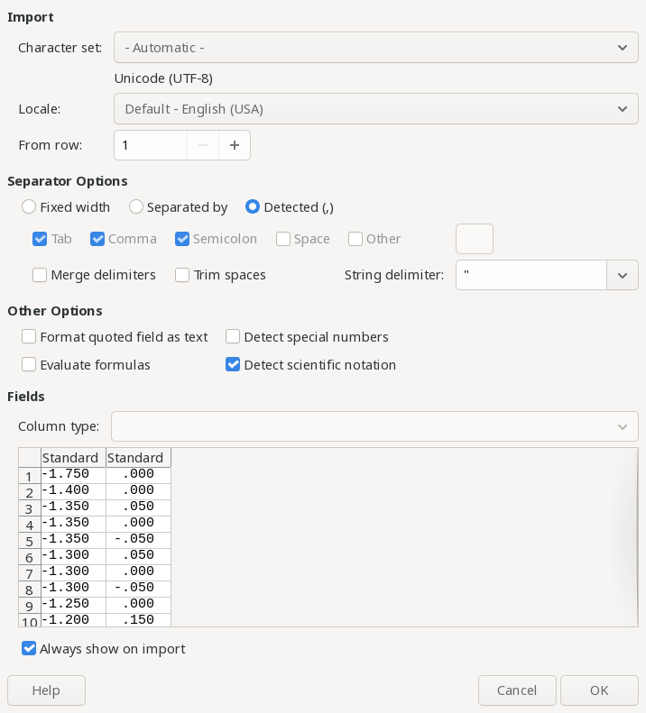
Everything looked okay to me, so I accepted the defaults. This loads the full data file into the spreadsheet, as two columns:
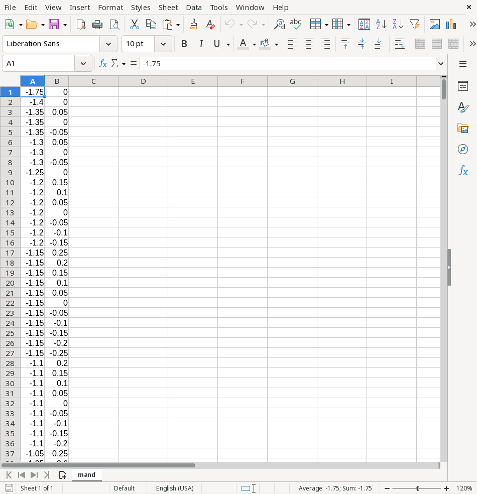
Use the Insert > Chart menu action to create a new chart using this data. Since the spreadsheet only has two columns in it, LibreOffice Calc should interpret the first column as the x data and the second column as the y data.
To plot the Mandelbrot Set data, I only needed to change two defaults in the LibreOffice Chart. First, set the Chart Type to “XY (Scatter)” and use “Points Only.” Then, turn off the legend and grids in Chart Elements.
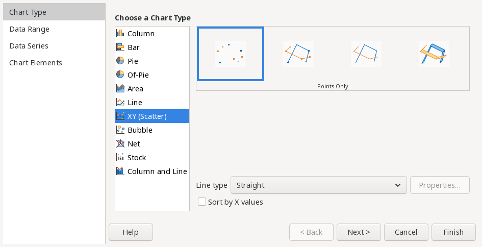
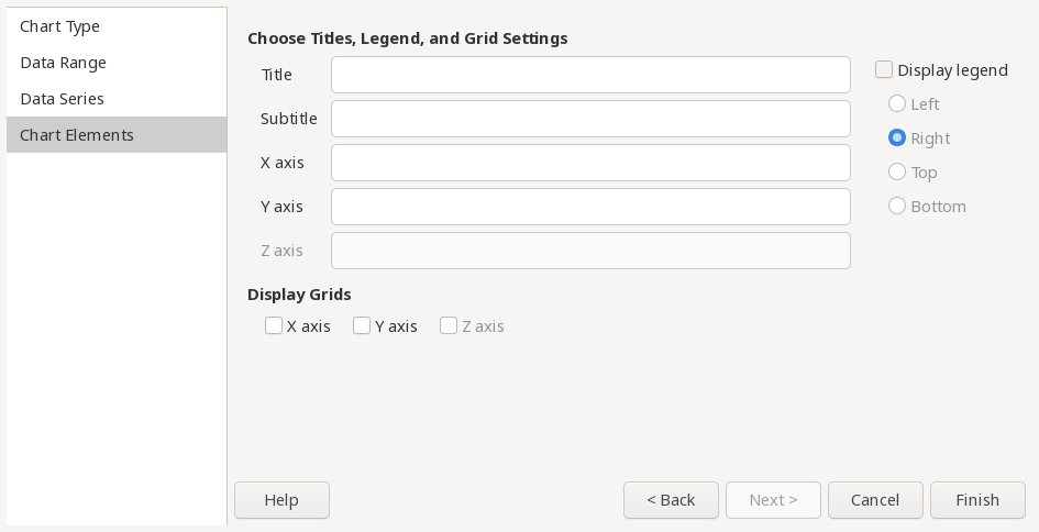
With those settings, LibreOffice Calc should generate a chart showing the Mandelbrot Set. Each point in the data set is displayed as a small dark-blue square, so the data is really just a low-resolution version of the Mandelbrot Set. But even in this “blocky” resolution, you can still see the familiar shape of the Mandelbrot Set.
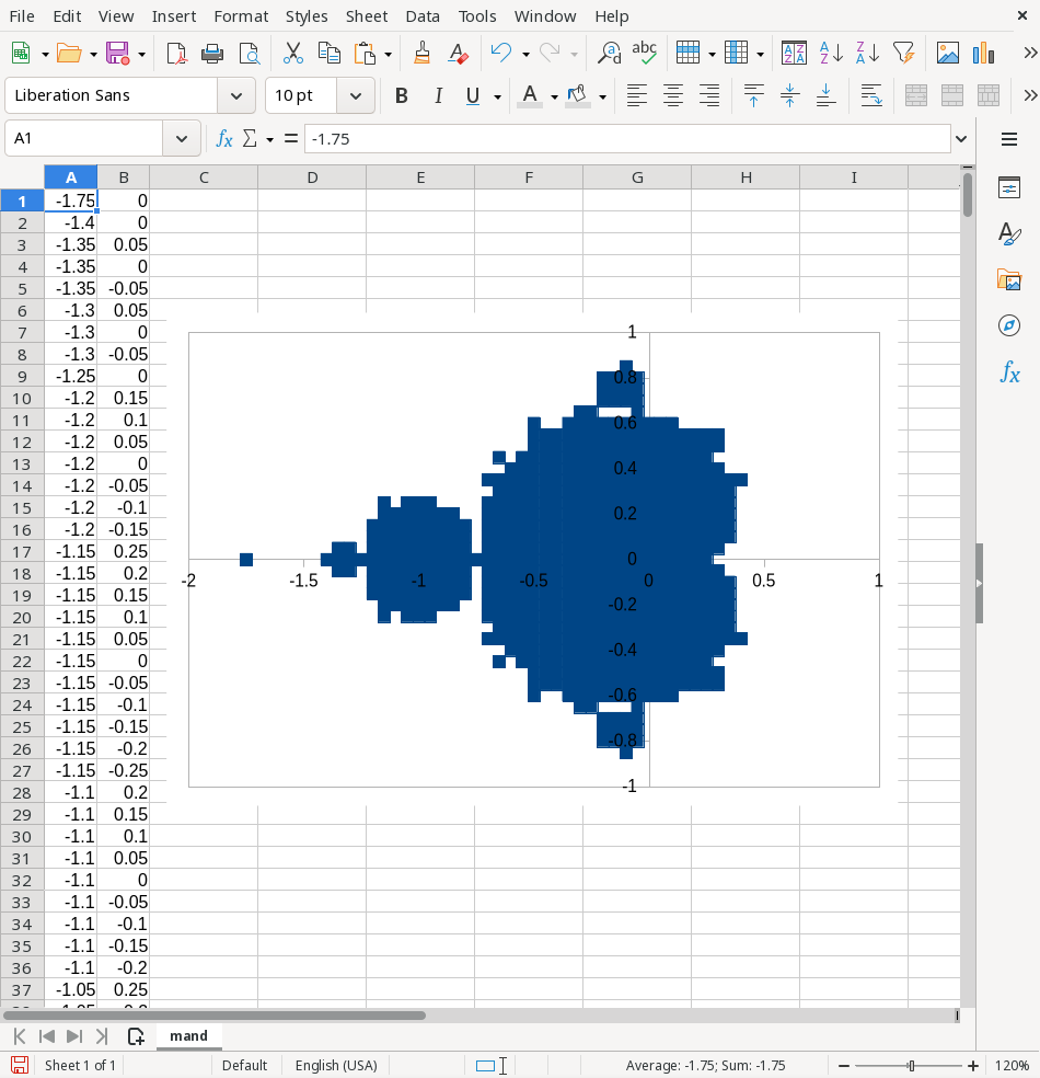
Plotting data in LibreOffice Calc
This demonstration is very similar to how I displayed data from programs, when I was an undergraduate student in the 1990s. And I think it’s a fun exercise to see what new things you can do just by writing a short FORTRAN program, and using a few cool chart features in LibreOffice Calc.
 Don Watkins

 David Both